Armocromia and Furniture
Colors affect our emotions

At least once each of us has come across this word: ARMOCROMY.
Although it is not yet a science, many of us have tried to study it or to be studied by an image consultant to define our palette and therefore find the right colors to enhance ourselves.
Through this method, by undergoing an accurate analysis of one’s complexion and undertone, it is possible to find the macro-categories to which they belong (which in turn are divided into subgroups which will not be discussed in this article): SPRING, SUMMER, AUTUMN AND WINTER.
However, fashion is not the only sector to have been overwhelmed by this trend, but also the sector of Design and Architecture has made this argument its own.
The colors influence our emotions and, even in a conscious way, produce in us more or less pleasant sensations.
In furnishings, the choice of colors is often preceded by the choice of style and, only later is the color choose with the inevitable result of having a total absence of harmony within one’s home.
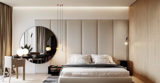
Floor, textiles and decorations must coexist in an environment confined harmoniously.
Recreeting a comfort at home, often it is not so simple, but having an environment in harmony certainly means enjoying an environment that arouses in us emotions such as well-being, protection, relaxation and that allows us to detach with everything that is at outside the walls of the house.
Before seeing the individual macro-chamberiers, it is good to define some principles that, regardless of the chromatic choice, will help us create harmony.
1. Start from a neutral and clear base
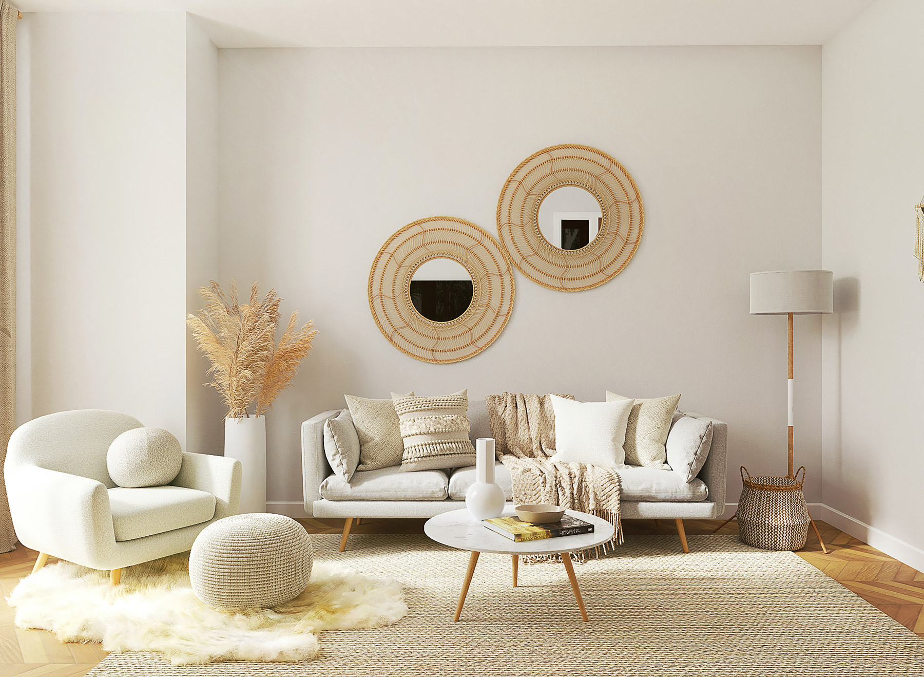
Beige, taupe, white are the perfect base from which to furnish a room. These colors visually expand the space and set no limits to creativity. Furthermore, considering that often a single room has multiple functions (relaxation, study, smart-working) and could be constantly changing, these colors will not be binding in order to carry out these activities.
2. Choose a predominant color and a complementary one
It is forbidden to fall into monotony by creating boring and visually flat environments.
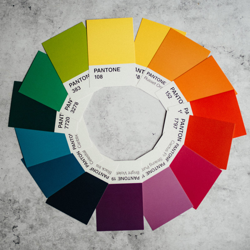
To determine the predominant color it is good to be inspired by the sensations that each color arouses in us, and why not, by your palette if you have already undergone an armochromy consultancy!
Once the predominant color has been identified, to choose the complementary color you can use the color wheel, remembering that two colors are defined as complementary when, placed next to each other, they “vibrate”, reinforcing each other’s brightness.
Once you have identified the predominant color, to choose a complementary one directly on the color wheel, simply choose the diametrically opposite one.

3. Balance the colors
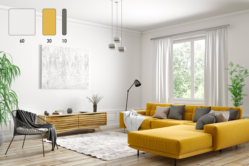
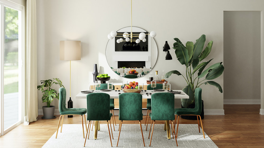
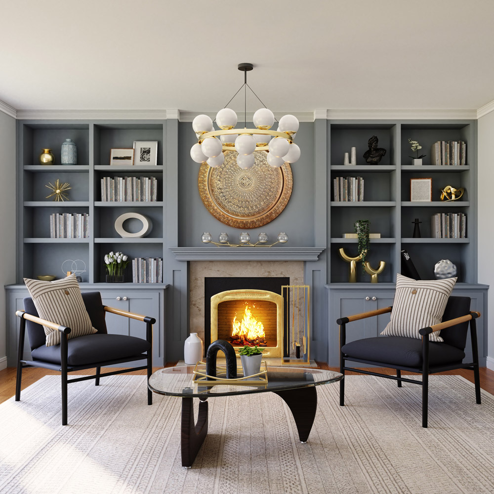
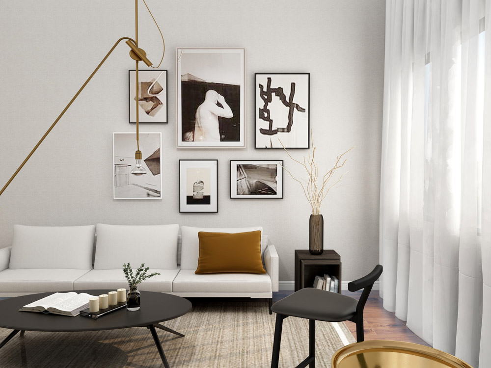
The 60-30-10 rule is still in force, which aims to balance the colors used within a confined space, in order to create harmony:
60% dominant color + 30% secondary color + 10% accent color.
60% is none other than the main color of the scene, i.e. the first color that catches the eye when entering a room and can be subdivided into larger objects (walls, textiles).
The 30% percentage is about half of the predominant color and serves to define the contrast without diverting attention from the main color.
The remaining 10% is usually a much brighter color than the first two, and is often present in small objects compared to the entire room (for example a cushion, a lamp, a finish).
4. Beware of light
This last point is of fundamental importance for the correct success of our aim, that is to create a room/house in armochromia. It is good to remember that light plays with colors: it illuminates them, transforms them, creates shades. Each color, therefore, depending on the light to which it is exposed, gives a different response.
It is therefore very important to evaluate the exposure of your home and the respective rooms beforehand.
In particular, in the case of new constructions, it is a good idea to divide the various rooms according to the orientation of the building: to the north the rooms that do not require high lighting (stairwell, pantry, closet); to the east the sleeping area favoring optimal awakening through the right inclination of the sun’s rays; to the south the rooms that require adequate lighting (dining room, kitchen, living room) and finally to the west the rooms dedicated to relaxation such as the living room.
Light therefore becomes a fundamental furnishing component and each environment deserves an appropriate lighting engineering study which will obviously depend on the activities for which the room will be used.
In natural light, which obviously depends on the percentage of transparent surfaces envisaged in the design phase, it is a good idea to carefully integrate artificial lighting.
Specifically, it is divided into:
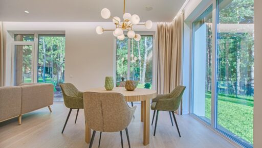
- Direct lighting, when the light beam is projected directly onto the objects to be illuminated without any type of reflection. Direct light is recommended in work and study environments, for example using a table lamp, but it is also of fundamental importance in environments such as the kitchen or bathroom. Just think of under-cabinet lights to illuminate the hob or chandeliers (whose height will depend on the height of the ceiling and the area of the room) to illuminate the dining table.
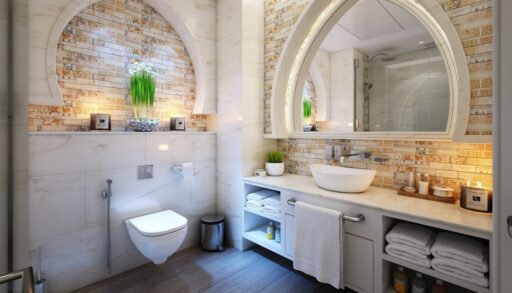
- Indirect lighting, when the light beam hits the objects to be illuminated after a reflection, generally on the ceiling or against a wall. It is perfect for creating warm and welcoming atmospheres and often balances the luminous contrasts produced by direct sources.
According to some lighting engineering studies, within a space it is best to balance direct and indirect lights according to natural brightness and not favor just one type.
Therefore, choosing a warm or cold light makes a difference and could compromise or reevaluate the choice of colours.
Once you have seen the main rules for furnishing an environment with harmony, you need to take into account some “tricks”:
- If you want to visually enlarge a small room you need to avoid dark colors on the walls and prefer light, bright and reflective colours.
- The horizontal lines, like those of the floor, visually expand the environment while the vertical lines along the walls make it slim.
- Se il soffitto è basso è consigliabile colorarlo di bianco e dipingere le pareti con colori contrastanti.
Having established these basic concepts, let’s now analyze the various palettes defined by color scheme.
Color harmony, as already mentioned, identifies four macro-categories which, respectively divided into further subgroups evaluated by defining: undertone or temperature (warm or cold), chromatic value (light or dark), intensity (high, medium, low).
The four macro-categories refer to the names of the time periods of the solar year:
SPRING SUMMER AUTUMN WINTER
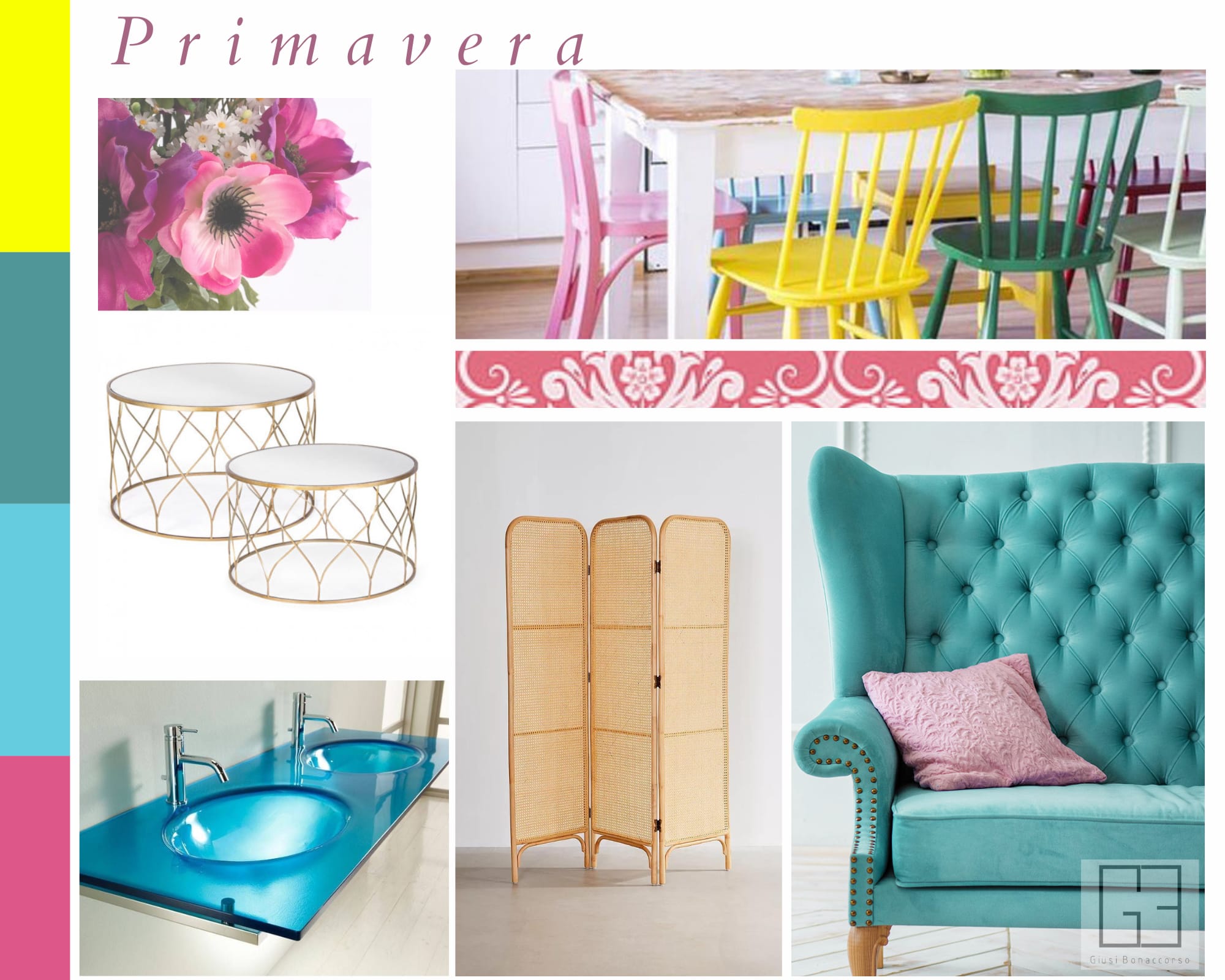
Light color value, high intensity and warm undertone. Spring gives us bright and warm shades.
Perfect with a vintage style, pinks and purples, greens and yellows are preferred and, like the season to which they belong, they are a mix of colors that recall flowery meadows.
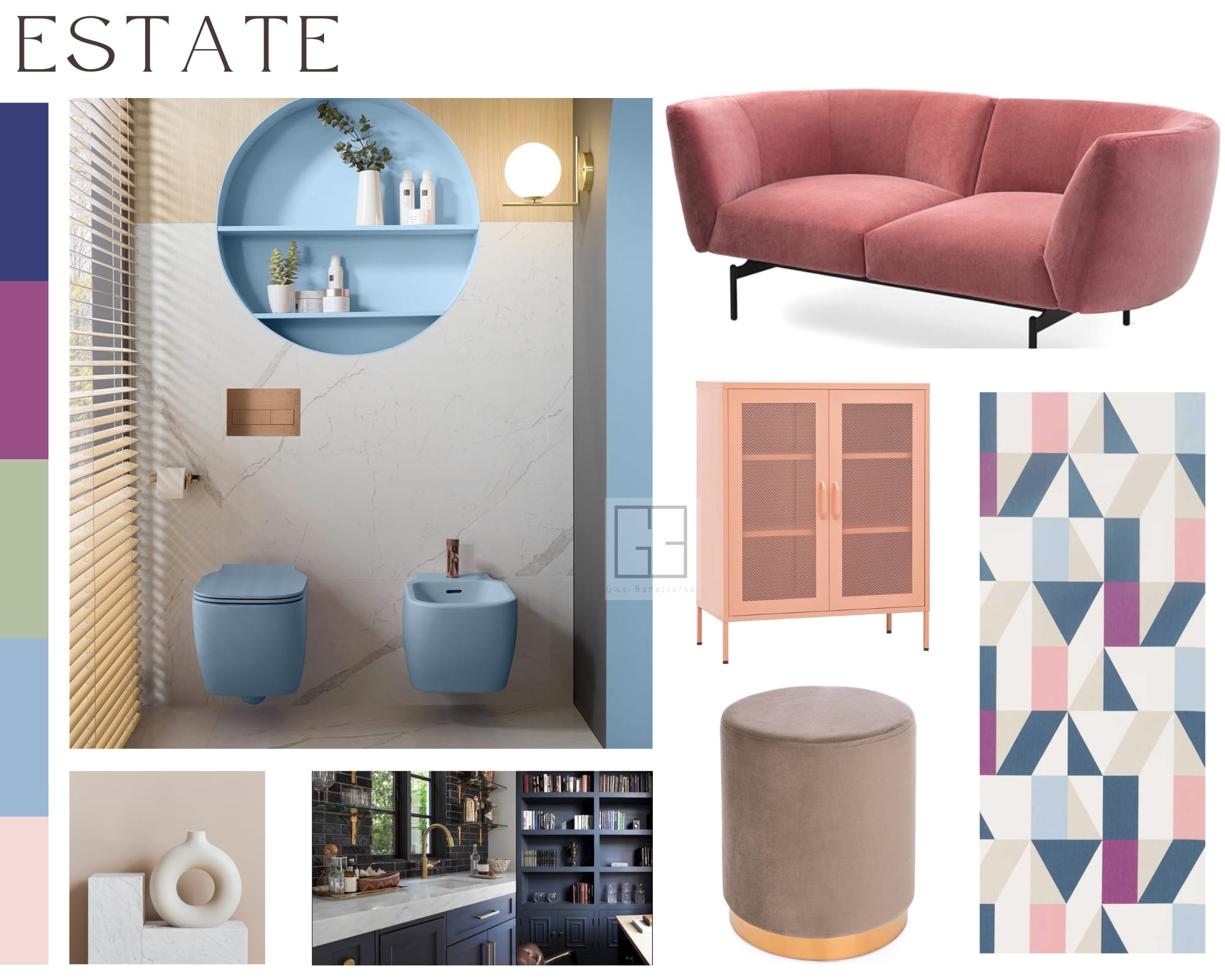
Light color value, low intensity, cool undertone. Contrary to what one might think, the summer palette includes cold and light colors, pastel and mother-of-pearl, but also mauve, blue jeans and grey.
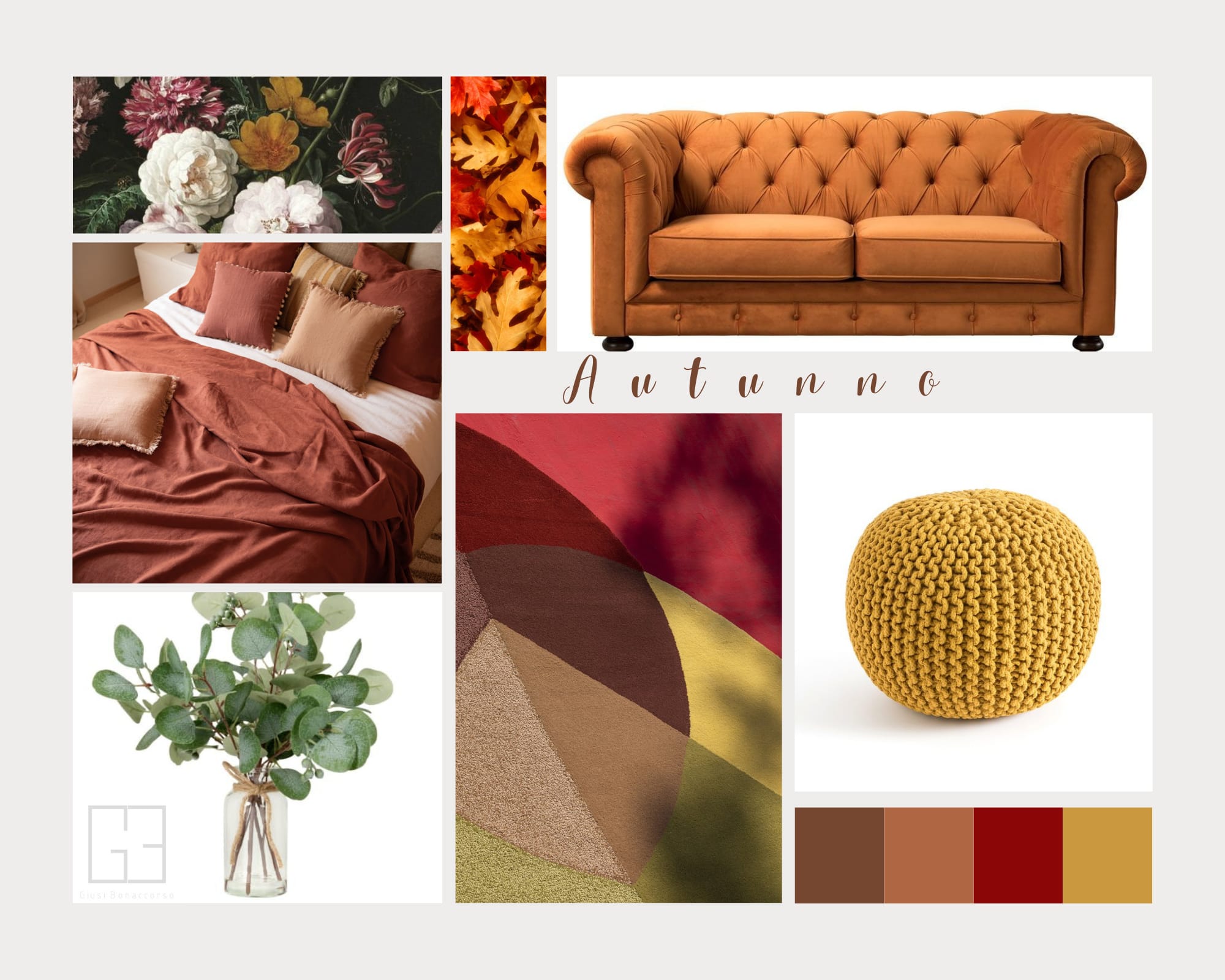
Dark color value, low intensity, warm undertone. Just imagine the colors of the foliage to immediately have this season’s palette in mind: browns, reds, oranges, yellows with warm shades. Beige, nude perfect colors to combine with the depths of teal or rust.
Dark color value, high intensity, cool undertone. Electric blue, fuchsia, lime yellow, black and gray colors that make up the palette of this category often combined in contrast with white or ivory.
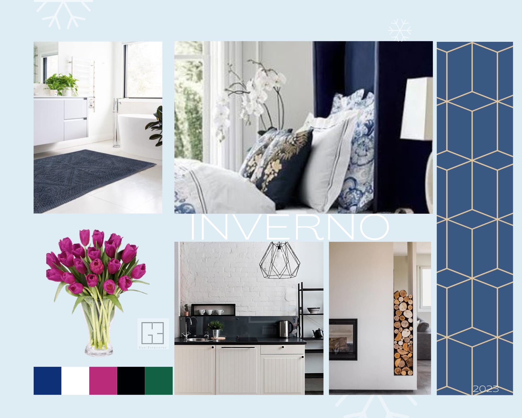
Choosing whether to furnish the entire home based on a single palette, or to assign different palettes to each room of the house is undoubtedly a completely personal choice. The advice is always to find the right balance between colours, lights and furnishing styles.
Based on this, a reference season could be chosen and used as a guideline for all environments. Bear in mind that, as already mentioned, each season has different subgroups (identified by the different combinations of color value, intensity and temperature) so there are many palettes available and allow us not to deviate too much from the chosen macro-category (spring, summer, autumn or winter).
But…how to choose the right palette to furnish your home?
As already written above, colors have the power to arouse more or less intense and more or less pleasant sensations in each of us. Therefore, carefully analyzing these sensations in front of the main colors is certainly the best starting point.
Choosing the color that excites us, which relaxes our sight and mind and which often gives us an inexplicable but pleasant sensation.
Once identified in the belonging palette, analyzed in the natural and artificial light present on site, all that remains is to follow these small rules, apply a little common sense in order not to exceed and create our environment in color harmony.
Based on how long, it would be essential to use color harmony also in public buildings such as hospitals (assigning very different colors according to the departments), schools, libraries and in premises used for commercial activities (food, clothing, furniture and furnishings, newsagents, sanitary ware, herbalists and much more) also strategically designing the furnishings recommended by the visual merchandisers.
In conclusion, harmony creates balance and connection between man and the space that surrounds him.


